Our customers often ask us what color palettes work best when designing graphics for LUMOplay's Motion Maker design tools, or for custom interactive floor and wall projection apps.
Your final display will be affected by the ambient light, the type of projector you use, and the projection surface, but our team has a few tips to help your projected content look as vibrant and attractive as possible.
Here are 3 rules to follow if you're designing graphics for projection:
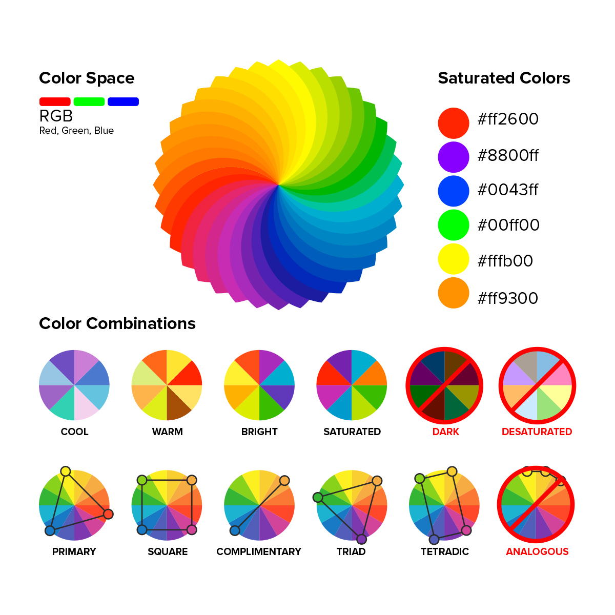
Work in RGB
When your projector (or any digital display) calculates colors, it uses the RGB palette. Working in RGB rather than CMYK or other color spaces meant for print will make the colors you see on your screen more accurate in relation to one another.
Test the design with your projector
Remember that when you shine a red light on a surface, the color will be impacted by the color of the surface and the surrounding light. Test your design by looking at it with a projector (preferably the projector you plan to use in your final installation). This will help you catch any color variations or issues right away, instead of after your app is already made.
Use contrast to keep game objects from blending with the background
This means using sharp outlines, saturated colors, and a color palette with contrasting colors. Designing your content with a lot of earth tones or several shades of the same color is not going to look as eye-catching as alternating between high contrast and/or saturated colors.

If you have any questions about designing custom interactive projector content, please Contact Us. We're happy to help!
